Product Designer & UI Developer
Kiu E-Commerce offers B2B software solutions for airlines, streamlining the reservation, check-in, and ticket purchasing processes.
The primary objective was to redesign and improve the accessibility of Kiu E-Commerce, focusing on creating a more user-friendly and accessible platform for booking and purchasing airline tickets.
As a Product Designer and UI Developer, I was responsible for identifying pain points in the user interface and improving the overall user experience, ensuring the technical implementation of the design updates was seamless and effective.
Evaluate current design
The initial step involved analyzing the existing web design to identify its strengths and weaknesses. In this case, it was crucial to enhance the website's responsive behavior to ensure proper adaptation across mobile devices and to improve accessibility.
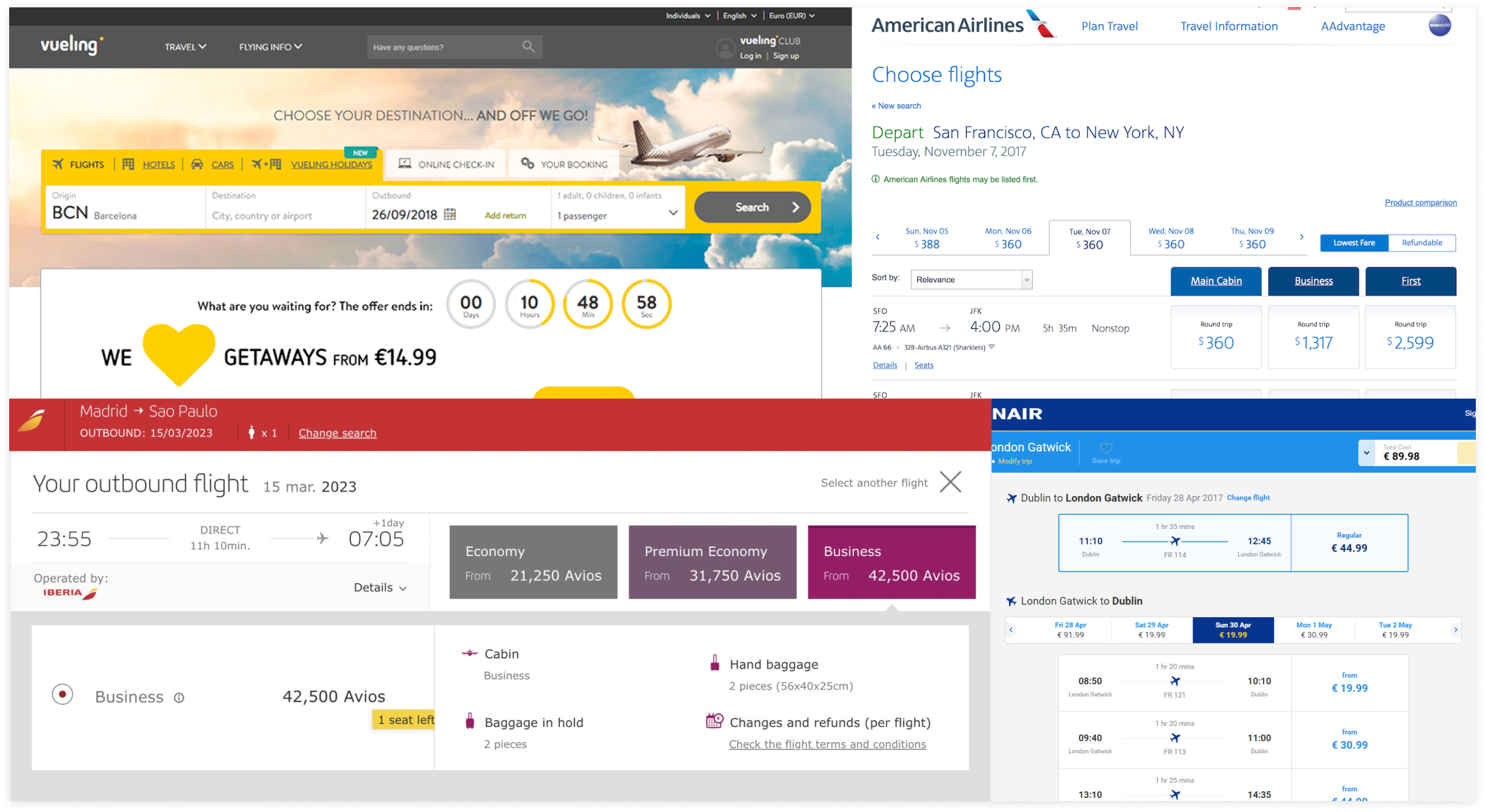
Competitive analysis
I focused on understanding user needs and preferences through interviews and analytics. Analytics played a crucial role in understanding how users interacted with the product. By analyzing the duration of use and the number of screens visited, I identified key pain points. This data really helped shape my suggestions on where we should concentrate our redesign efforts. Additionally, I conducted a competitive analysis to further refine our strategy.
Set Clear Goals
Focus on Information Architecture and User Flow
My primary focus was on deeply understanding the existing information architecture and user flow, as technical constraints prevented any structural changes. This thorough comprehension was crucial for identifying key areas that needed significant attention to optimize usability and effectively meet user needs.
Key Pages to Prioritize
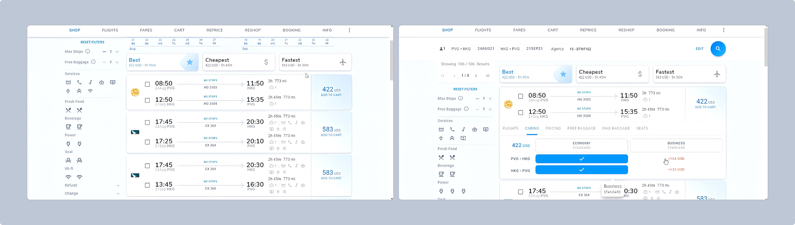
Our analysis pinpointed the 'Search Flights' page and the 'Flight Results' page as critical components driving user engagement and conversion rates. By concentrating our efforts on these pages, we aimed to streamline the booking process, reduce user friction, and ultimately increase the overall efficiency of the platform.
Key Challenges:
Initial web platform
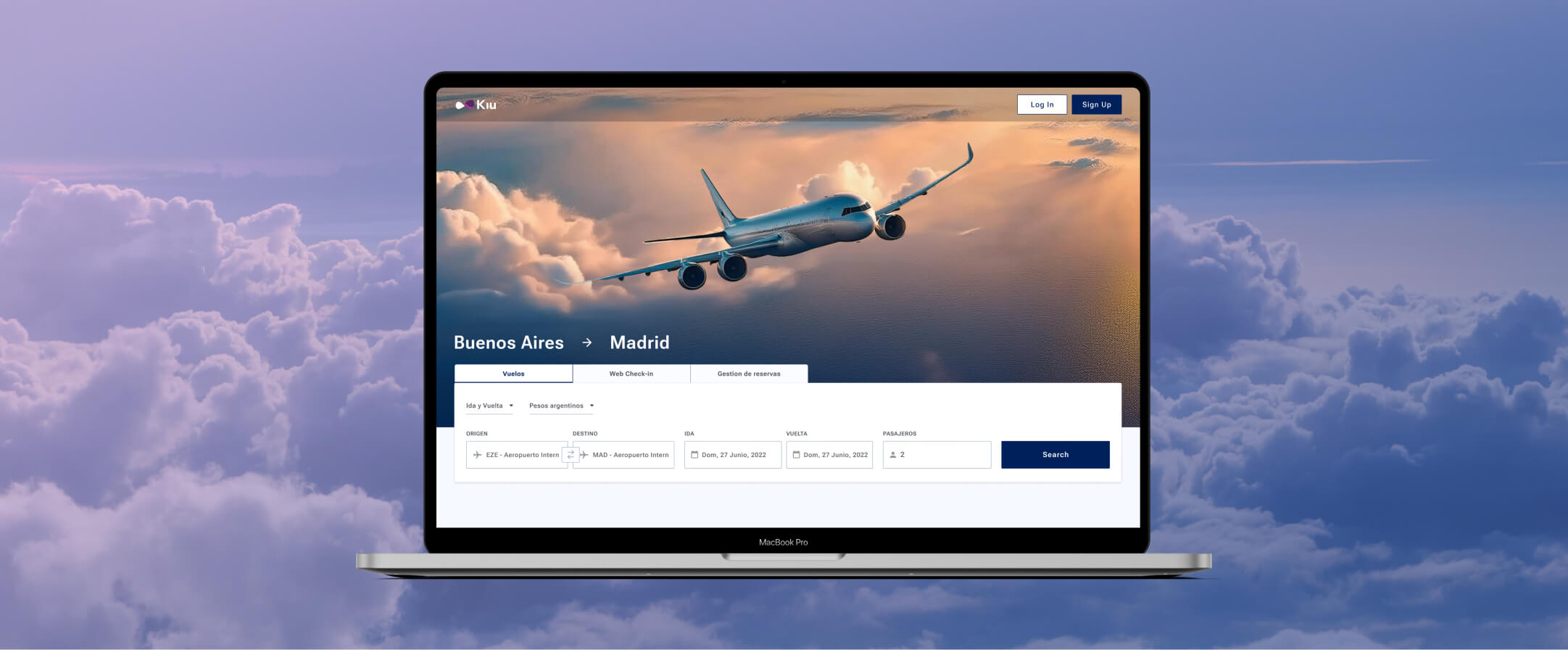
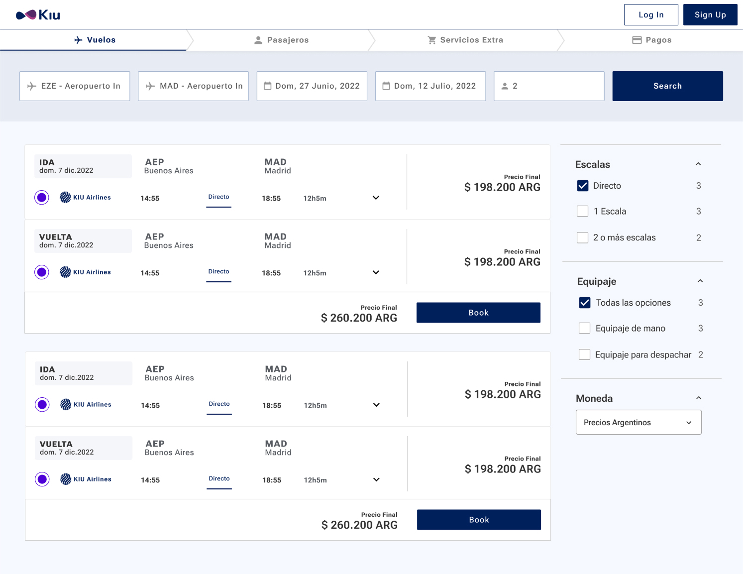
The result
Usability testing
I focused on testing the design solutions to ensure they met user needs and project goals. I created detailed prototypes that closely mirrored the final product, allowing us to conduct usability testing with real users. These prototypes served as a critical tool for gathering feedback and observing how users interacted with the designs in a realistic context. Through this testing process, we identified some areas for improvement. This iterative approach allowed us to make data-driven adjustments.
To facilitate the transition of the design assets to the development team, I created clear and detailed documentation within Figma, outlining all necessary design specifications, interactions, and visual guidelines. This documentation serves as a comprehensive guide for developers, ensuring they have all the information needed to implement the designs accurately.
Additionally, I coordinated closely with the development team, arranging meetings as needed to clarify any ambiguities and address questions.
The work doesn't end with the handoff. In the Monitoring phase, we continuously track the product's performance to identify areas for improvement. I work closely with the QA team to ensure that the final implementation remains as true to the original design as possible. This ongoing collaboration involves reviewing the product in its live environment, comparing it against the design specifications, and addressing any discrepancies that arise.
Through usability testing, it was proven that the user experience has significantly improved. This validation through direct user feedback underscores the effectiveness of the redesign.
The redesigned booking page was progressively implemented across all client airlines, enhancing the user experience and interface consistency. This initiative significantly improved the booking process, making it more intuitive and efficient for users. My contributions to the booking page were also integrated into the newly launched design.
This redesign has been a key factor in our ongoing enhancements in the airline industry.